PROJECT: Save Turtles
ROLE: UI/UX Designer
TIMELINE: 3 months
Project vision
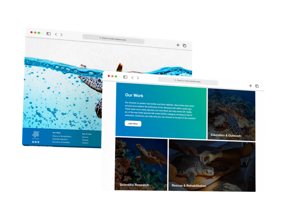
Save Turtles is an ever-growing international group of scientists, conservationists, and concerned citizens works together to achieve an otherwise unattainable common goal. The organization is focused on protecting sea turtles and their habitats through rescue and rehabilitation, scientific research, and education and outreach.
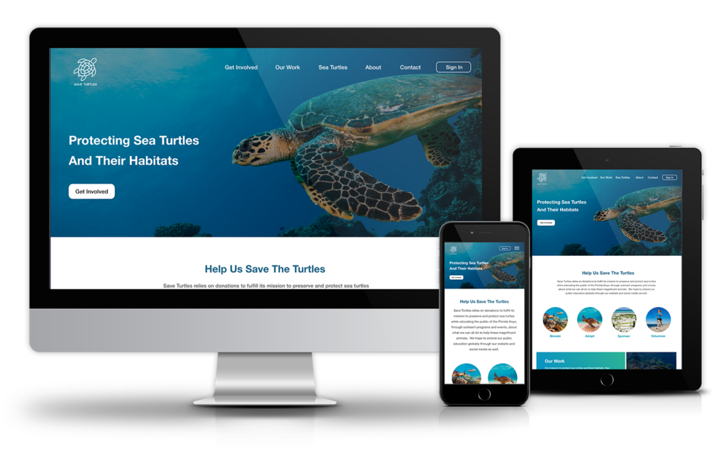
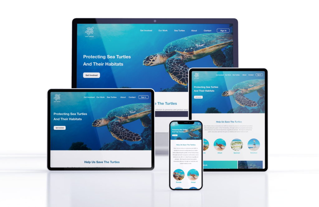
To carry out its programs, Save Turtles is in need of a platform for educational outreach programs and donations. The organization expressed its willingness to have a responsive website and a dedicated app for this purpose.
Challenges
Allow users to get involved easily in the conservation of sea turtles through donations, adoptions, sponsorships or volunteering.
Provide users with the possibility to view and track their contributions when logged in the account.
Allow users to choose the sea turtle they want to adopt and set up regular payments.
Ensure users do not feel like they have to donate a certain amount or commit to long-term donations.
Kickoff
Our goal was to design a responsive website and app that will improve education on the topic of sea turtles conservation and allow people easily make a donation for sea turtles conservation. Qualitative research methods proved to be the most effective during our design process, most notably our user interviews and usability testing sessions.
“What is the product and who is it for?”
“Who are our biggest competitors?”
“How can we make it stand from other apps?”
“Who is our primary audience?”
“What are the challenges we will face moving forward?”
Preliminary ideation
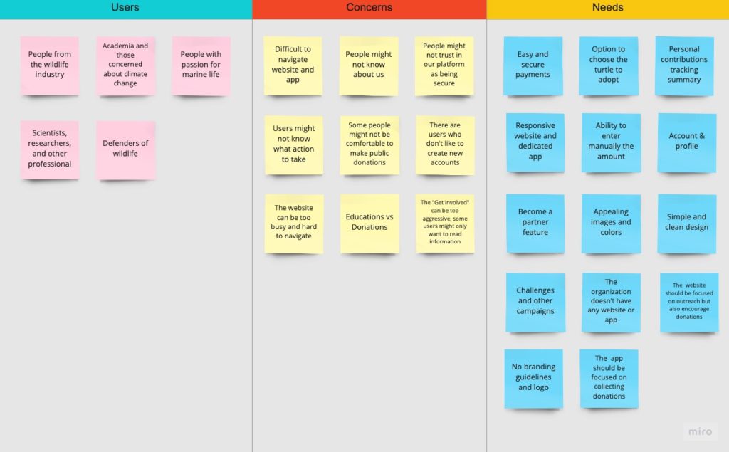
We used affinity mapping to identify not only the general scope of Save Turtles, but to decide which direction we wanted to take the product. This was a form of brainstorming during our kickoff period that proved to be very helpful in setting up the foundation for the rest of our process.
Research Insights
We used Save Turtles’ data on endangered sea turtles to develop interview questions, which were then used to conduct user interviews. Most interview participants reported feeling badly about sea turtles, but they didn’t actively try to help protect them and their habitat.
The feedback received through research made it very clear that users would be open and willing to work towards protecting sea turtles if they had access to an easy-to-use tool to help guide them and they were open to contribute financially for this big cause.
93% of participants stated they would make donations if they were guided and informed about the cause.

82% of participants stated they prefer to set up monthly donations in advance.

75% of participants stated they would prefer to track their contributions and receive reports from the organization about their impact.

All of participants stated they would like to have a dedicated app to manage their donations and contributions.

68% of participants stated they would love to choose their favorite turtle to adopt and receive regular updates about it.

50% of participants stated they would like to be able to share with friends or on social media easily the campaigns running on the website.
Meet the Users
AGE: 58 years old
EDUCATION: PhD
HOMETOWN: Washington, DC
FAMILY: Married, 2 children
OCCUPATION: Marine Biologist
Maria Clark is a marine biologist at Oceana in Washington, DC. She is passionate about educating the public regarding wildlife and conservation, including endangered species. Maria and her husband, John, has two sons, one is a scuba diver and the other one is a marine biologist like her.
AGE: 32 years old
EDUCATION: Bachelor’s Degree
HOMETOWN: Bradenton, FL
FAMILY: Single
OCCUPATION: Personal Trainer
Ray Thompson is a 32 year old personal trainer in Bradenton, FL. Leaving by the ocean, he has been always passionate about the marine life. In his spear time, he enjoys being at the beach surfing, snorkeling, or simply enjoying the breeze and the sound of the ocean waves.
Competitive Analysis
We looked at several potential direct and indirect competing websites and apps. Our goal was to identify the missing features and design Save Turtles a much better experience.
The majority of the features between competitors were very similar, however the main differences that we noticed were:
- Poor IA and CTAs vs well organized websites
- One vs multiple ways to contribute
- Simple and clean interfaces vs cluttered websites
- Responsive vs non-responsive websites
- None of the competitors have a dedicated app
- Old and unappealing websites vs bright and beatiful websites
- Some websites would take users to a third party website to make the payment
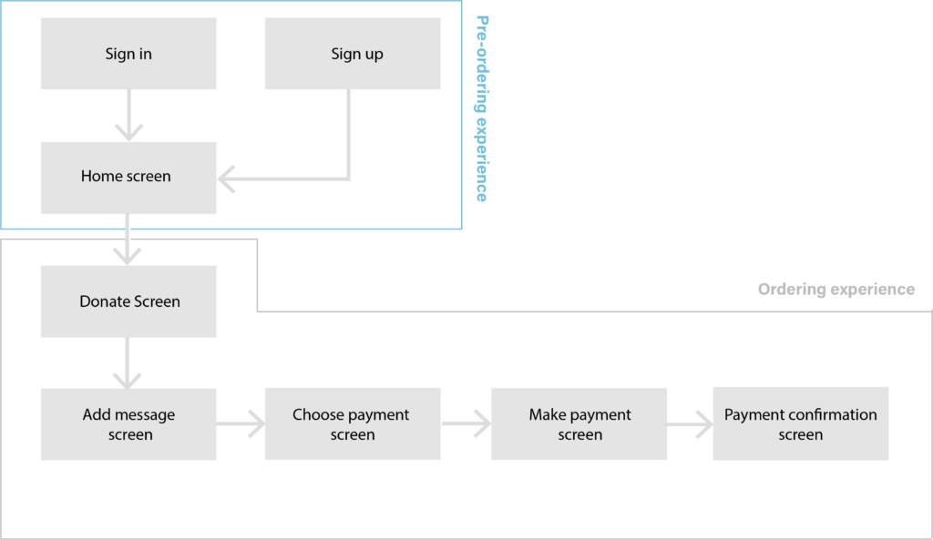
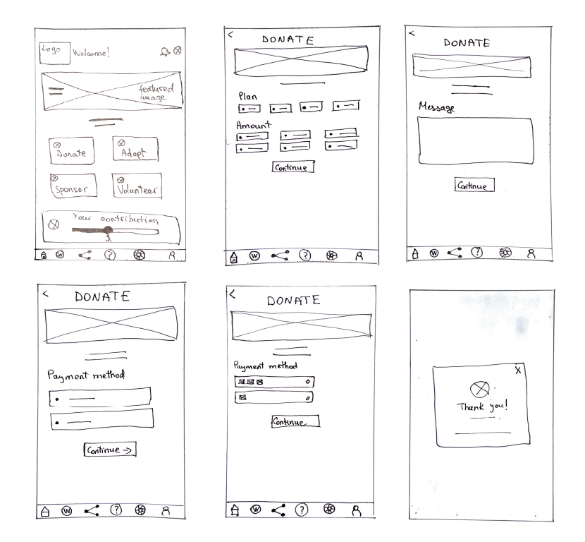
Wireflow
After sketching out some wireframes and thinking through the preliminary flow, we reviewed what was necessary, unnecessary , and what areas needed improvement. We poured a lot of our time into this step to make sure we had the finishing touches on the underlying UX before moving onto the visuals.
Iteration
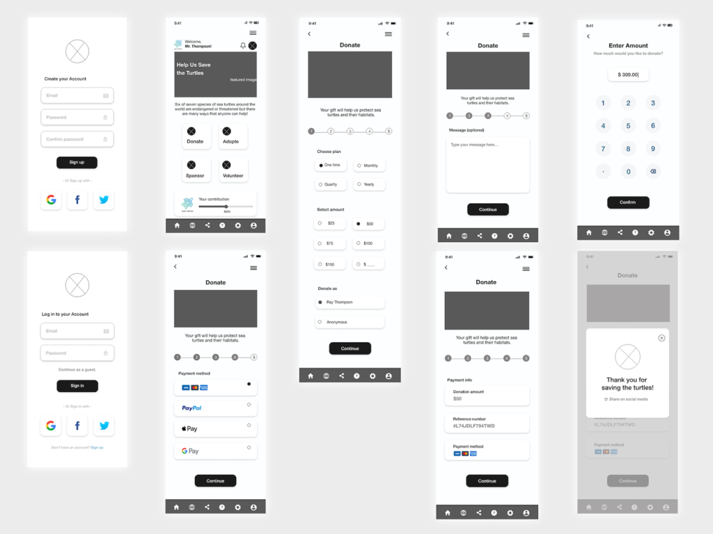
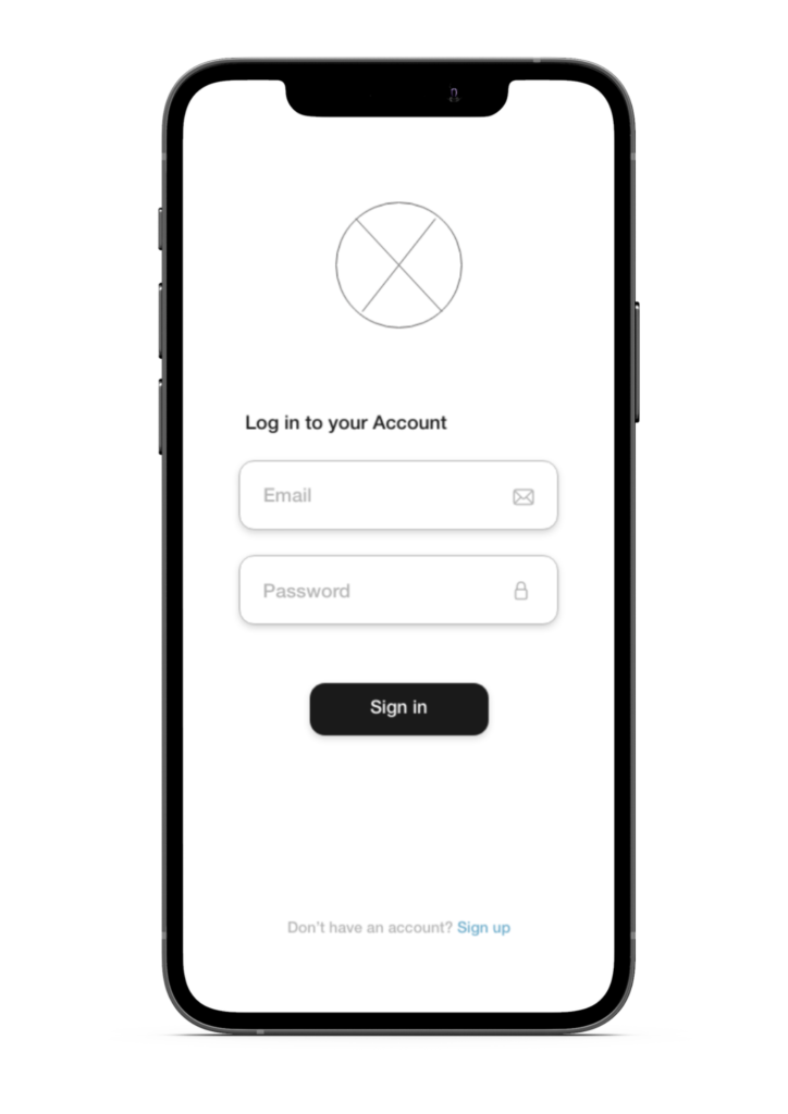
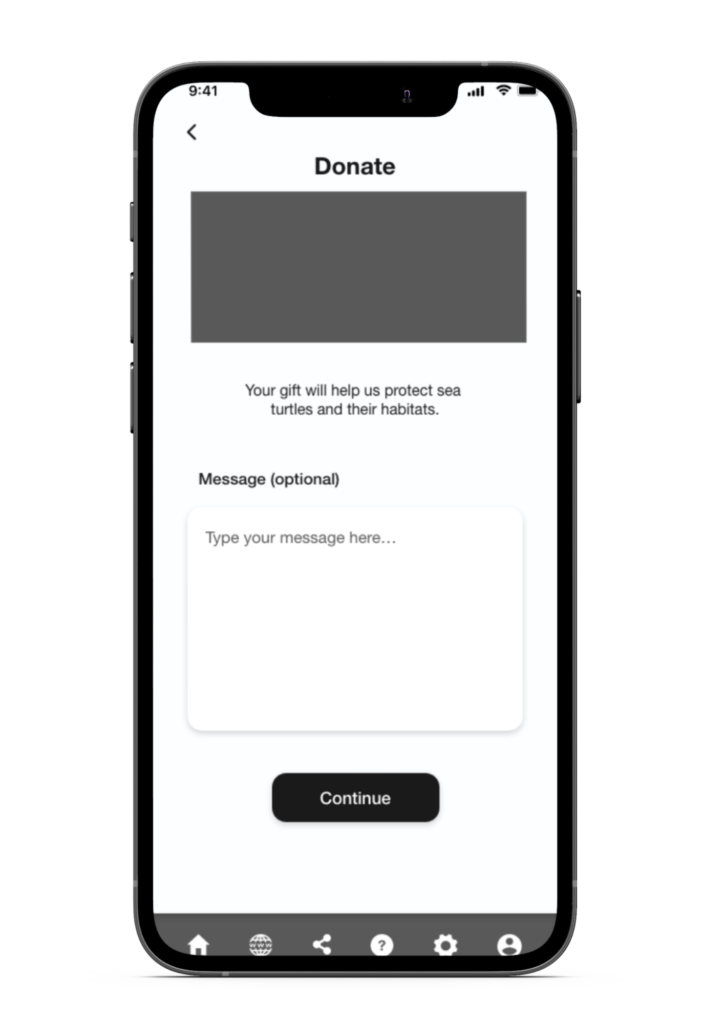
After creating our prototype from low fidelity wireframes, we conducted an unmoderated usability study. Different participants were asked to make a donation for the conservation of sea turtles in our prototype in hopes of garnering enough feedback to use for our next set of design iterations.

Most users were unhappy with the fact in order to make an account one needs to create an account. Thus, users need to be offered the possibility to sign up/sign in with a social media account or donate as a guest.

Some users were dissapointed to see only one method of payment. Users need to be provided with more payment methods, as well as the option to save the preferred method of payment in user's account.

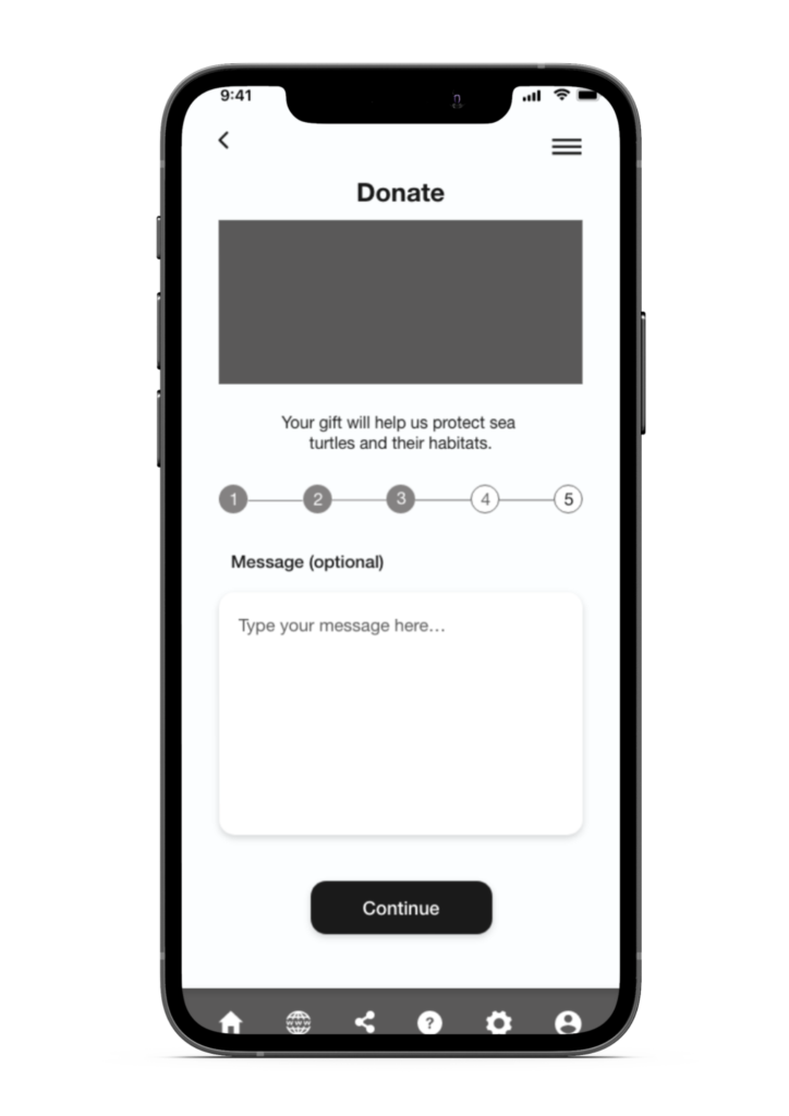
Users preferred to know about the number of steps needed to be taken in order to make a donation. Thus, we have added a progress bar for a better user experience.

A great number of users expressed the willingness to make donations anonymously. Users need to be offered the possibility to make payments anonymously.

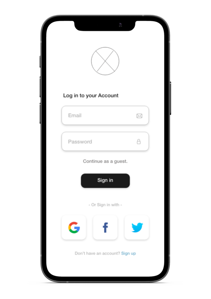





Mockups
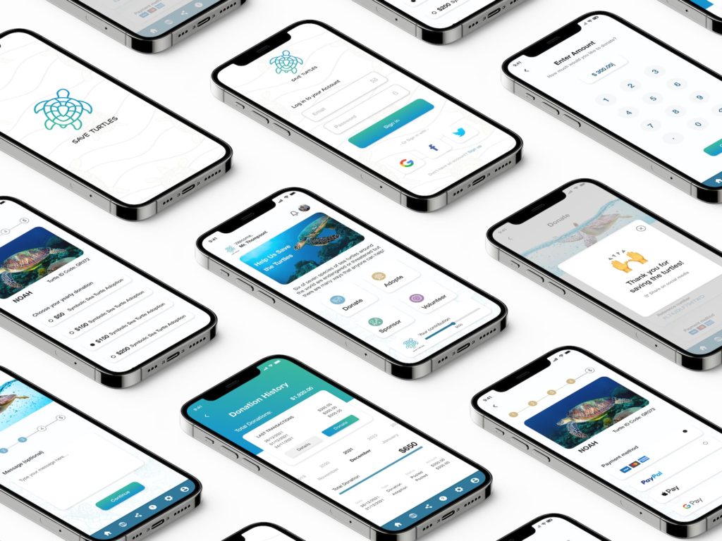
Following the 1st iteration phase, we have pursued with the creation of the high fidelity mockups. Once the mockups were ready, we have conducted a second round of the usability study to gather more feedback from users. Based on their feedback, the mockups have been refined again.
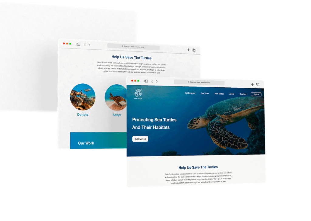
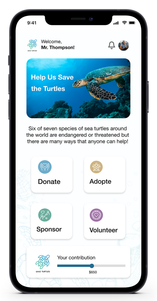
The main objective of Save Turtles is to allow users to make a contribution to the conservation of sea turtles quickly and easily. To achieve this, it is essential to design a clean and simple interface. The ways to contribute to the conservation of sea turtles should be the main focus point of the home screen.
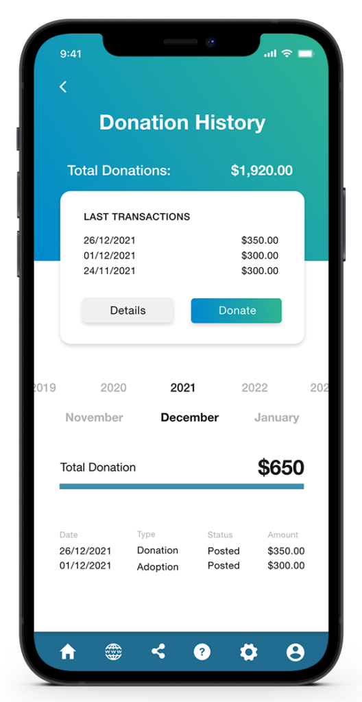
Users needed to be able to view and track their donations. Save Turtles offers account holders the history of their donations, which can be viewed by month, year, or total.
The history of donations also includes details of transactions, such as date, amount, status, and type of transactions. This information can be accessed only when logged in.
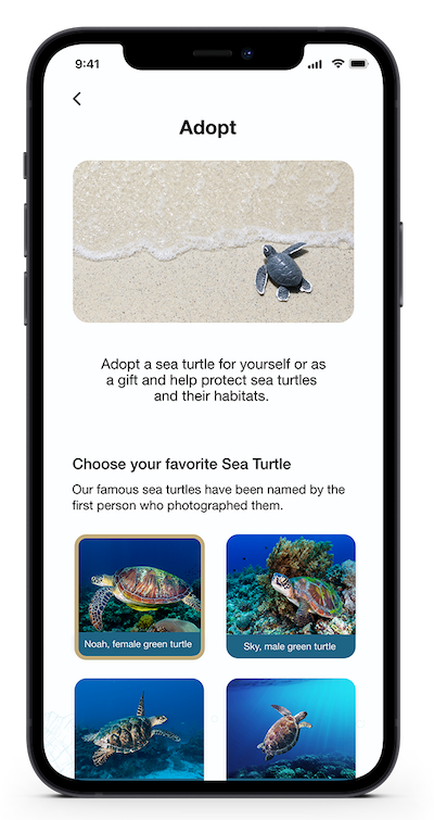
The research has shown that users prefer to choose the sea turtle they want to adopt. Thus, before adopting a sea turtle, the users have the possibility to browse the sea turtles available, read about them and then choose the preferred one. Every sea turtle has a name, a brief description and details about its location, age, sight.
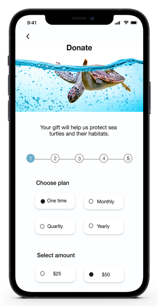
Save Turtles is designed to raise awareness about the importance of protecting sea turtles and their habitats. users are offered a few ways to contribute, either financially or non-financially. Moreover, users are offered with the possibility to choose the amount they want to donate, as well as the frequency of donations. It does not ask users to commit to long term donations, they can make a one time donation or set periodic donations.
Style Guide
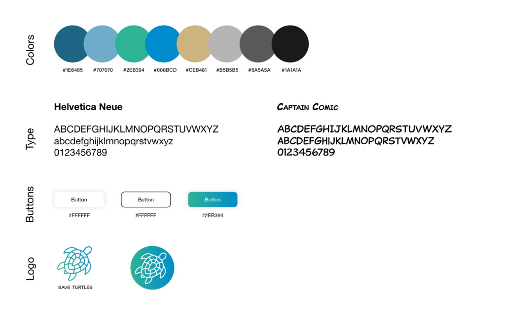
Take a dive under the sea with these beautiful color combinations inspired by ocean life. Our coastal color palette conjures driftwood grays, the glimmer of frosted sea glass, and briny waves of blue. These colors remind us of the beautiful oceans and turtles.
The main typeface of choice for the app and responsive website is Helvetica Neue. We wanted to select a sans-serif typeface that would bode well with the rounded edges within our interface, as well as the black/white contrast inside of the app.
Takeaways
We learned that even though the problem we were trying to solve was a big one, diligently going through each step of the design process and aligning with specific user needs helped me come up with solutions that were both feasible and useful.
